Project Description
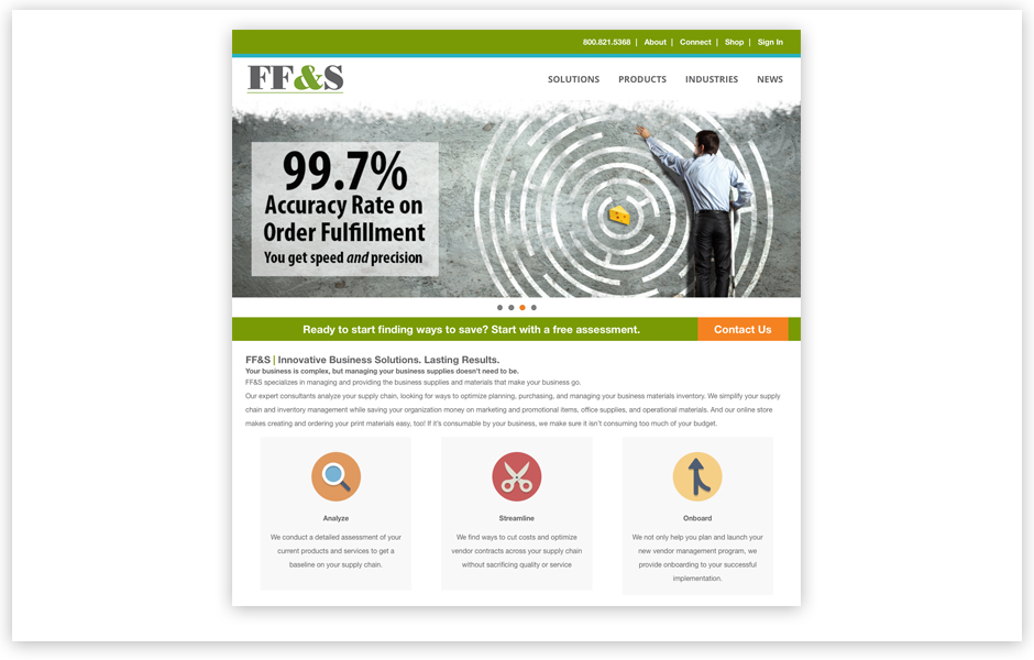
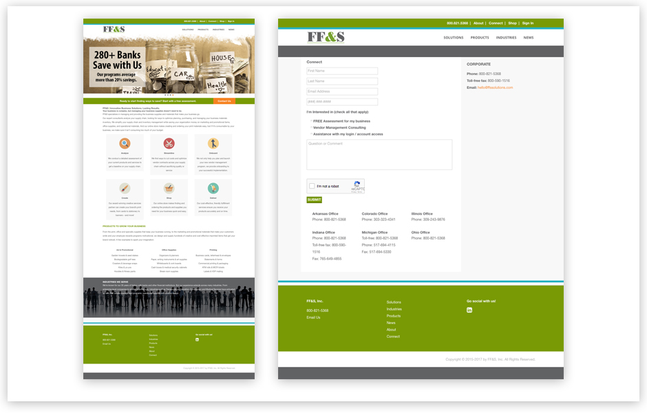
FF&S, Inc. was looking for a new website that not only better promoted the services they offer, but was also mobile and tablet ready for streamlined accessibility for their customers. This company has grown tremendously over the years. They serve banks and other financial institutions nation wide. It was crucial to them that they stay ahead of their game by reinforcing ease of use to current customers as well as potential clients. They wanted a site that clearly explained who they are, what they do and how they can better serve their target audience than the competition.
We assessed the situation fully, reviewed past and present collateral and reviewed the competition. Working with WordFuse on the content strategy and messaging, we produced a plan that would deliver the goods. We then sketched out site concepts that defined the color hierarchy, brand consistency, content strategy implementation, site structure, SEO and tagging opportunities. Once the final look and feel was approved, the site was built, tested and approved.


